You have a good angle, a good product, and your ad still looks like every other one in the feed. The problem is often neither the message nor the visual: it's the layout. The same promise, presented as a lifestyle photo, a comparison or a customer review screenshot, doesn't produce the same effect at all.
This guide walks through the 15 static ad formats found in the ads that keep running on Meta, grouped by what they set out to do: show the product, prove, compare, trigger the purchase, or blend into the feed.
There's nothing theoretical about this breakdown. It's the framework CreaFlow AI uses to automatically classify the ads it records, and the last section shows how to go from a format you've spotted to your own creative.
Format or angle: two different things
The angle is the reason someone buys: “it lasts all day without touch-ups”. The format is the way the ad is built to get that reason across.
The same angle can be adapted to almost every format:
- as a checklist, it becomes a list of ticked-off benefits;
- as a customer review, a satisfied buyer's sentence under her five stars;
- as an us vs them, a comparison with the product that had smudged before noon.
That's what makes the distinction useful. When an ad fails, you don't know whether the idea or the layout is at fault. Keeping the angle fixed and changing the format is the only way to settle it. Finding the angle itself is the subject of the find ad angles page.
The formats that show the product
The most classic ones. They work when the product sells on its looks or on what you can see of it.
Packshot
The product alone, cut out, on a plain background. No person, no setting.
What it does: it puts the product at the center, with no distraction. Effective for a product people already know, an object whose design is the selling point, or an audience that has already visited your store. Its limit: it tells no story. On an audience that doesn't know you, it's often the easiest format to ignore.
Lifestyle
A polished photo of a person using or wearing the product, in a real-life setting.
What it does: it lets the viewer picture themselves with it. It's one of the most common formats in the ads we record, precisely because it's versatile. Its limit: it's also the one that looks most like an ad. In a feed saturated with polished photos, it blends into the crowd.
Ingredients
The product surrounded by its raw materials: the fruit, the plants, the components.
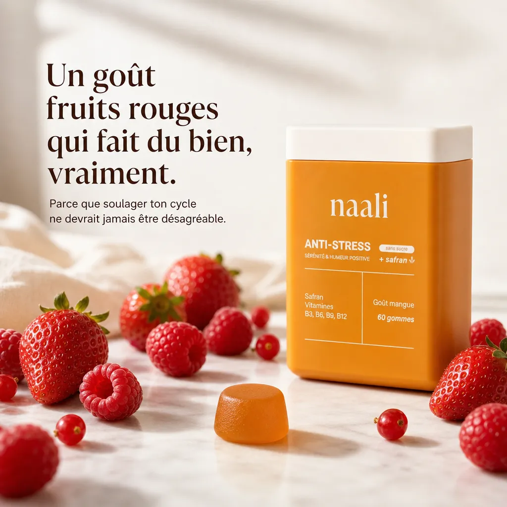
What it does: it makes what's in the product visible, and therefore credible. Highly effective in cosmetics, food and supplements, wherever the buyer reads the label. Its limit: it's useless if your ingredients aren't a selling point in themselves.
Callout
The product at the center, with arrows linking its parts to benefit boxes.

What it does: it explains a technical product at a glance. Perfect for anything with several functions, a particular material, a design detail you wouldn't notice in a simple photo. Its limit: beyond four arrows, nobody reads anymore.
The formats that prove
They answer the question every buyer asks when facing an ad: is it true?
Customer review
A review screenshot, with clearly visible stars and a buyer's testimonial.

What it does: it lets someone other than the brand do the talking. People believe a customer more readily than a slogan. Its limit: it only exists if the reviews are real. Inventing or doctoring a review is a misleading commercial practice, punishable in France.
Before / after
Two images side by side, showing the transformation of the same subject.

What it does: it shows the result instead of promising it. No other format proves as fast. Its limit: it's the one Meta watches most closely in health, weight loss and beauty. Trying to create a negative self-image or promising a result gets the ad rejected, and the rules changed in 2026: reread the current advertising standards before launching in these sectors.
Infographic
A composition built around data: a very large number, a percentage, a chart.
What it does: it turns a selling point into a fact. “9 out of 10 customers” sticks better than “most customers”. Its limit: the number has to be true and you have to be able to back it up. A percentage pulled out of nowhere destroys more trust than it creates.
The formats that compare and remove doubts
They answer another question: why this product rather than what I already use?
Us vs Them
An image split in two: your product on one side with check marks, the alternative on the other, duller, with crosses.

What it does: it lets the viewer make the comparison themselves, and so draw the conclusion themselves. Ideal for a product that replaces a well-established habit. Its limit: target a category (“regular toothpastes”), not a brand. Comparative advertising that names a competitor is strictly regulated by the French Consumer Code, and it's rarely a risk worth taking.
Checklist
A vertical list of benefits, each preceded by a check mark.
What it does: it stacks up selling points with no reading effort. A list reads faster than a paragraph, especially on a phone. Its limit: five points at most, and filled-in check marks. Empty boxes that look clickable can be taken for a fake interface element, which Meta rejects.
The format that triggers the purchase
Only one in this family, but it has a role of its own: it doesn't convince, it gets people to act.
Promo / offer
A visual dominated by the offer: big discount, crossed-out price, countdown.

What it does: it turns a vague interest into an immediate decision. Essential for sales, a launch, a win-back. Its limit: it sells the discount, not the product. Used all the time, it teaches your audience to wait for the next promotion before buying.
The formats that blend into the feed
What they have in common: not looking like an ad. In a feed where the eye has learned to skip anything that looks sponsored, that's often what makes the difference.
Ugly
A deliberately raw production: a photo taken on a phone, text slapped on in a hurry, a sticky note, a scribbled-on screenshot.

What it does: it breaks the avoidance reflex. An image that looks like it was made by an ordinary person is read as content, not as advertising. It's also very quick to produce, which lets you test a lot. Its limit: “ugly” doesn't mean “sloppy”. The message has to stay perfectly clear, otherwise you simply have a bad ad.
Fake chat
A staged conversation: text message bubbles, an exchange of messages, a fake tweet.
What it does: it presents the product as a recommendation between friends, and nobody can resist other people's conversations. Its limit: it must not imitate Facebook's interface. Meta rejects visuals that reproduce elements that don't work, such as a fake notification or a fake button. A stylized conversation gets through; a Messenger notification badge gets the ad rejected.
Meme
A well-known humorous image template, with a caption that gives the situation a twist.
What it does: it makes people smile before it sells, and a meme gets shared. Effective on a young audience, for a brand with an offbeat tone. Its limit: a meme ages within a few weeks, and many templates reuse protected images. Go for a situation you stage yourself instead.
Text-only
No product, no face: a strong message, set in type, on a plain background.
What it does: it forces the read, because there's nothing else to look at. It works when the sentence is so right that an image would be too much. It was the removal of the 20% text rule, in September 2020, that made it possible. Its limit: it rests entirely on the hook. An average sentence in text-only is an empty screen.
Advertorial
A visual that imitates a press or blog article: big headline, photo, start of a paragraph.
What it does: it borrows the credibility of editorial content and makes you want to read on. Suited to products that need explaining. Its limit: never imitate a real media outlet, its name or its logo. Making people believe a newspaper is talking about you is a misleading commercial practice.
The 15 formats in one table
| Format | What it does | Best used when |
|---|---|---|
| Packshot | Shows the product with no distraction | The product is known, or its design is the selling point |
| Lifestyle | Lets people picture themselves with it | The product is used every day |
| Ingredients | Makes what's in the product credible | The buyer reads the label |
| Callout | Explains at a glance | The product has several functions |
| Customer review | Lets a buyer do the talking | The product raises doubts |
| Before / after | Shows the result | The transformation can be photographed |
| Infographic | Turns a selling point into a fact | You have a true, striking number |
| Us vs Them | Lets the viewer compare | The product replaces a habit |
| Checklist | Stacks up the benefits | The selling points are many and simple |
| Promo / offer | Triggers the purchase now | Sales, launch, win-back |
| Ugly | Breaks the avoidance reflex | The audience is tired of polished visuals |
| Fake chat | Tells the story of a recommendation | The product gets recommended between friends |
| Meme | Makes people smile before it sells | Young audience, offbeat tone |
| Text-only | Forces the read | The hook stands on its own |
| Advertorial | Borrows the credibility of the press | The product needs explaining |
How to choose the formats to test
Don't pick three formats from the same family. Three lifestyle variants succeed or fail together, and teach you almost nothing.
The combination that teaches you the fastest: one format that shows the product, one that proves, one that blends into the feed. For example a callout, a customer review and an ugly ad, all on the same angle. If all three fail, it's the angle that needs rethinking. If only one takes off, you know which layout your audience prefers, and you can build variations of it.
One last benchmark, on frequency. In the ads we record, lifestyle and promo are among the most widespread formats, while the checklist, text-only and the infographic are among the rarest. What's rare isn't better on principle, but that's where your ad has the best chance of not looking like the one next to it.
Going from a format you've spotted to your own creative
Knowing the formats isn't enough: you need to see how others execute them, in your niche. The Meta Ad Library gives you those examples for free, provided you know how to filter it, and CreaFlow AI's Chrome extension saves them in one click while you browse.
Once you've spotted an ad, whatever its format, you can clone it: the tool reuses its layout and its mechanics, then regenerates the visual with your product, your brand and your angle. No element of the original image is reused.
The app's Formats tab sorts the ads it collects using this grid: pick a format, select real examples, and the clone follows that format's codes with your product.
And when you want to go beyond static, Flow also generates videos and carousels for you from the same material.
Page written in September 2026. The example visuals are creatives produced with CreaFlow AI. Meta's advertising standards change regularly, particularly in health and beauty: check the rules in force before launching a campaign in a regulated sector.